Pages

Saturday, September 28, 2019

3 Steps to Creating An Accessible Website

Website owners want all visitors to their site to be able to access the content. This requires ensuring the site is accessible so no one is left out. Making a site accessible is not intuitive, but once you understand the basic concepts you'll discover:
  • It is not difficult, 
  • it becomes second nature, and 
  • accessible content is better content. 

Fortunately, more and more platforms support the ability to create and maintain websites that are compliant with the Web Content Accessibility Guidelines (WCAG). Here are steps you can take to ensure you have a site that can be accessed by everyone including the 15-20% of the population who have disabilities.


Step 1: Choose WCAG 2.0 Compliant Theme or Template

The first step is to select an accessibility-ready theme or template. Most sites allow you to search for accessible themes or templates. Some are even moving toward making them all accessible. 

While many accessibility issues can’t be addressed effectively if you have an inaccessible theme, some sites, such as Wordpress, have plug-ins that may help with common accessibility problems. 

If you are having trouble, contact your provider for guidance. They usually have a list of accessibility-ready options. 
A screenshot of the W3C Web Content Accessibility Guidelines page
The web content accessibility guidelines

Step 2: Accessible Content Creation 

Once you have a theme or template chosen, or a plug-in added to solve the underlying accessibility of your site, you need to create, or re-create, accessible content for the site. 

Content remediation/creation includes: 

Here are a few resources to help you learn about accessible content:

Step 3: Develop Accessibility Testing Plan

Ensure ongoing compliance by creating a regular WCAG 2.0 AA evaluation schedule.  

Tuesday, September 24, 2019

Replace Gifted & Talented with Inclusive Programs

In places like New York City students as young as four-years-old can take high stakes entrance exams for gifted and talented programs. To help their children get in to the gifted and talented programs, parents may pay for expensive test prep to give their child an edge. While this is one approach, there is a more inclusive approach that provides opportunities for all students including those with disabilities, those for whom English may not be their first language, and those of all socioeconomic levels.  

Schoolwide Enrichment Model

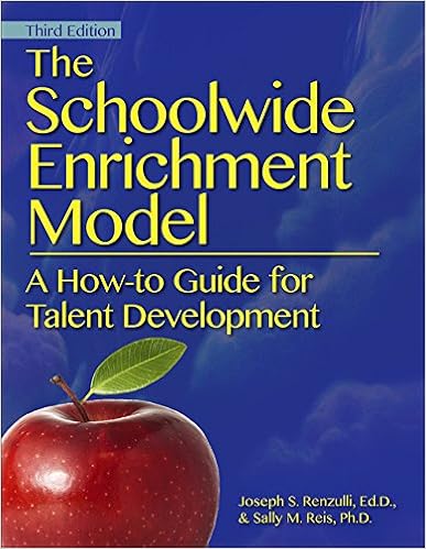
Book cover for: The Schoolwide Enrichment Model by Joseph S. Renzulli, EdD, and Sally M. Reis, Ph.D.
The Schoolwide Enrichment Model (SEM) is a program based on the idea that we should apply the pedagogy of gifted education to enrichment opportunities for all students. The broadened conception of giftedness, allows children to explore an area of interest, talent, or passion in depth, while in a small multi-age group with other students and a facilitator who also shares this interest. Enrichment Clusters are a delivery vehicle for disseminating enrichment pedagogy to every student and is founded on the belief that everyone has the potential to demonstrate gifted behavior. 

A Model for Everyone

This is a model for everyone. It is a model that recognizes any and all talents a student might have or want to explore.

In fact, it was a model that had gained popularity in New York City and flourished in places like The Island School. Using this model, staff at The Island School nurtured the Multiple Intelligences of all students through a rigorous program for talent development. Staff systematically identified student’s strengths, nurtured skills, and created authentic opportunities for students to utilize these skills. 

These skills were used not just as students, but also as practicing professionals providing experiences and opportunities to work and learn with others in the fields in which they are interested. These opportunities create pathways for future study, employment and lifelong pursuits. This is one of those schools where the world inside the school walls mirrors that which students will experience out in the real world.

Inclusive Gifted & Talented Programs

In New York City a diversity panel made the recommendation to end gifted and talented programs for the elite. This was met with some criticism, however, the recommendation was misunderstood by some. It was not a call to end gifted and talented programs. Instead, the recommendation is to find the gifts, talents, passions, interests and abilities that can be found in all of our students. 

The creators of this model, Sally Reis and Joseph Renzulli recently explained in a New York Daily News article how their model can be extended to all students. 

Thursday, September 19, 2019

Simple Way to Determine Your Website's Accessibility

The Americans with Disabilities Act and the Rehabilitation Act of 1973 say the websites of all government agencies and those that receive federal funding must be accessible to everyone including those with disabilities. This means all public schools and schools that receive any federal funding.

Making your website accessible requires content contributors to know strategies such as using meaningful hyperlinks, proper color contrast, using alt text for images, and formatting with proper heading structure.


Determining your website's accessibility

Fortunately, determining a websites accessibility is quite simple using a tool call WAVE Web Accessibility Evaluation Tool.  Simply visit the site and paste the url into the field.


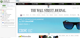
Screenshot of the WAVE website at http://wave.webaim.org. In the empty field is the website wsj.org


The WAVE Report

Once you hit enter you will get a report with errors and alerts. 
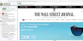
Screenshot of the results of the Wall Street Journal. It shows 16 errors and 39 alerts.


Reading the Report

To read the report, simply click the red flag to determine your issues. In this example we see there are issues such as missing alternative text. To learn about the issue, simply click the "i" next to the issue for more information.
Screenshot of the WAVE report. The flag is selected to reveal errors such as missing alternative text. such as

More information

When you select the little "i" you receive more information about the error. You'll learn the following:

  • What it means
  • Why it matters
  • How to fix it
  • The standards and guidelines

Screenshot of "More Information" about the error: Missing alternative text.


Content Management Systems

This is the first step in testing a websites accessibility. After the automated testing, a human can take a closer look at the errors and alerts. When you do, you may find that the content management system hosting the website is not accessibility friendly. If that's the case, do your best to reach out to them to change that or switch platforms.

Sunday, September 8, 2019

Heading Structure Guidance to Make Content Better & Accessible

Proper heading structure not only helps to make content accessible, it also helps to make content better for everyone. 

Here's why content is better with headings 

Structure

Headings allow those visiting your content to see the structure more easily. It allows screen readers to identify the structure and read it aloud.

Table of Contents

When you create proper heading structure, it automatically generates a table of contents that you can insert into your document.

Outline

When you use heading structure, in Google docs, it creates a handy, dandy outline view in your document.

Hyperlinks

In Google docs, every heading has its own hyperlink. This makes it super easy to link someone to a specific section of your content. 


Screenshot of this article in Google Docs showing the outline structure that results from headings.
This is what happens in Google Docs when using headings.

Heading basics

Heading 1

Heading 1 is the heading for the page. It often is also the title of the page and tells users what the page is about. 

Heading 2

Heading 2 helps organize content into sections. 

Heading 3 and beyond

Heading 3 down to heading 6 are subsections of the prior heading. A subsection of heading 2 would be heading 3. A subsection of heading 3 is heading 4. This goes all the way to heading 6. 

It’s important to keep your headings in chronological order. Never skip a heading.

Learn more about accessible content

The Web Content Accessibility Guidelines provide detailed information on how to create accessible content in a number of ways. Visit the guidelines to learn more about the guidelines in general or headings in particular.

Wednesday, September 4, 2019

Making Print Documents & Posters Accessible

Innovative educators often use print documents. This may occur when displaying posters, student work, or infographics on a wall or bulletin board. Another common reason for print is when information is handed out, mailed, or back packed home to families.  Usually this material is not accessible to all people including those with disabilities or who speak languages other than English, but it doesn't have to be that way.

Making Print Documents Accessible

People who need assistive technology to read materials--whether because of a disability or because of their needs for translation--have to have digital versions to use with their assistive technology.  For that reason, whenever you create something that's “for print,” you must:
  • Host a digitally, accessible copy of print documents somewhere such as on your website. 
  • Include a link to this document, or the website where it is hosted, on the printout you provide.

Formatting

The way you format a print document also affects how accessible it is. Consider creating a large print version of the content. This requires the document use:
  • Use large print with at least 18 point font
  • Use a sanserif font like Arial or Calibri
  • Use high contrast of at least 4:5:1

QR Codes

QR Codes are one way for people with disabilities to get from a printout to an equivalent web page. 
  • To generate a QR Code, visit your favorite QR Code generator. Pick one that won't expire. If you're not sure how, check out these tips and these instructions on how to generate a QR Code.
  • Once you provide a link, a code is generated that can be placed in a document, along with the phrase, Access a digital version of this < poster, flyer, etc> above the QR code.
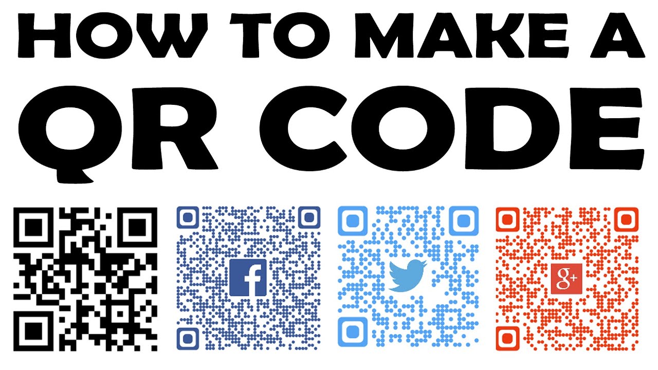
Says: How to make a QR code then shows four QR codes: Generic, Facebook, Twitter, Google. The photo is from a video on how to make QR codes.
Don't know how to create a QR Code? Watch this video.

Alternative Experience

Keep in mind however, that QR codes may not be a preferred option for everyone. Your best option is to provide access to content in a variety of ways such as:
  • Braille copies of your print document
  • A large print version of the content
  • Have flash drive handy for digital download
  • Send the content to your audience digitally via email or text

Inaccessible Digital Platforms

There are still many digital platforms that are lagging behind in their ability to make accessible content. This is particularly true for publishing platforms that create content like brochures, flyers, and infographics.

Alternative Digital Content

The best option is always to generate original content on an accessible platform. If that is not possible, you must provide an alternate, accessible version of the content. This can be:
  • An accessible Word or Excel document
  • An accessible Google document
  • A webpage which contains all of the information provided by the inaccessible platform

Your Turn

What do you think? Is this something you have tried or would try? Do you have other ideas for making print material accessible? Anything missing?